Examples
Very Simple |
Examples of using NetMaker and neural network applications.
Simple NetMaker project - classification
Download example (2MB) - project and data files, archive contains both Very Simple and 2D Classification examples.
Short introduction:
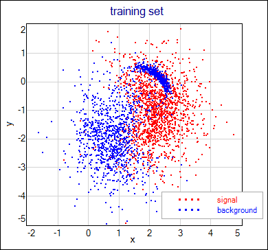
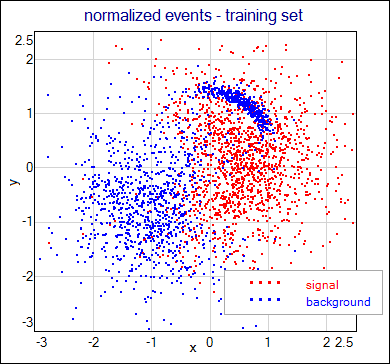
There are two classes: Red (let's say signal) and Blue (background). Events of these classes have two features (x, y) so they can be represented as points in the scatter plot like in the image below, where the training set is shown. Network task is to separate classes in the best possible way.
What is in the project:
Project in this example is very simple. It consists of two DataSet blocks that hold training and testing events and the Network block. Training events are presented above, testing events have the same distribution (but there is 100x more of them). Training set is an ASCII file - you can look at it and compare its structure with formatting string in the training_set block. Each line in this file represents one event. First two values are the features of the event, third value is the desired network output for this event. Network have single output neuron and it is expected to give value of
0.05for background (blue) events and value of0.95for signal (red) events. Network structure is fixed (one hidden layer with 10 units).
How to run this example:
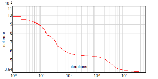
Network block is already connected to the training_set block. Network training parameters are set up. You just have to open the Go dialog window of the Network block, push there Go! button and wait. Save iteration info is switched on, so you can watch how the network error decreases (select menu Edit - Add Graph - Network Error, rigth click in the plot window to open a context menu, select Add Net Source to open dialog window, select Very Simple \ Network in the Available data objects list and push OK). If everything works well, plot looks more or less like in the following image (note that the X axis is changed to the log-scale to show rapid decrease of the error at the begining of the training):
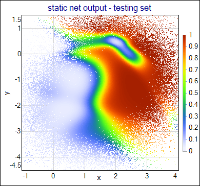
When the training is done you can save the network to the file. Then you can run the network over the events from the testing_set block (first connect this block to the network input and then switch the Training Method to JustRun and push Go! button). To see the network answers and compare them with target values push Setup button on one of the DataSets and go to the Preview tab. More comfortable way of checking the network results is to make the scatter plot of the events coloured with the network output. To create such a plot choose menu Edit - Add Graph - XY Data Points, rigth click in the plot window to open the context menu, select Add XY Data to open dialog window, select Very Simple \ testing_set in the Available data objects list, change ConstColor to TopoI and push OK (other options in this dialog window should remain with default values in this case). You should get something like this:
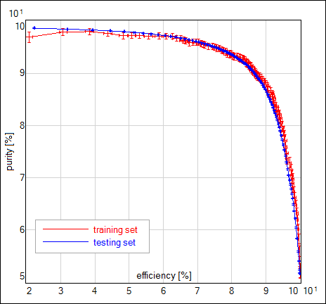
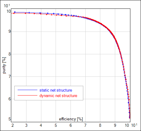
Another way to measure the quality of the training results is purity-efficiency plot. Purity is the fraction of the signal events in the set of the events with the network answer above given threshold τ. Efficiency is the fraction of the signal events with the network answer above the τ, but in the set of all signal events. The more signal events survive the selection the higher efficiency we get. The "cleaner" is the set of the events that survived, the higher purity is obtained. We would like to get both values possibly high. Mentioned threshold on the network answer is adjustable, so pairs purity-efficiency for different threshold values create a whole curve. We can compare the curves calculated for the training and testing sets - it is a very good test against the overtraining effect. If curves are far beyond the statistical errors, used training set is not representative for our signal / background distributions.
To create purity-efficiency plot choose menu Edit - Add Graph - Signal Selection, rigth click in the plot window to open the context menu, select Add Data Source to open dialog window, select Very Simple \ testing_set in the Available data objects list, check Mark Errors and push OK button; add the purity-efficiency plot for Very Simple \ training_set in the same window (change the color of this curve before you click OK). Results usually looks like on the following image:
2D Classification
Download example (2MB) - project and data files, this archive contains both, Very Simple and 2D Classification examples.
Short introduction:
The network task and data sets are exactly the same as in the previous example. More program functionality is presented here: data flow, preprocessing and simple use of the triggering. Although the normalization is not crucial for data used in this example, N(0,1) normalization is applied here to show how it works.
What is in the project:
Project contains training_data and testing_data DataSets that read events from the files. Transform blocks normalize events to zero-mean and unitary standard deviation at each position of the input vectors. Normalization calculations are started by prepare_data trigger block. Normalized events (stored in the normalized_data and normalized_data(test) DataSets) are used to train the network. Dynamic network structure is used to allow the network to choose the best hidden neurons multiplicity. At the end of the training process the network model (architecture, interconnection weights) are written to the
2d_classif.NetAsciifile. After each training/testing run events are separated (basing on the target value:t1=0.95Fis signal,t1=0.05Fis background) and sent to the output DataSets. Network is triggered by network_start block.
How to run this example:
All the connections between blocks and other setup is ready. Push Go button on the prepare_data block to start the normalization. You can look at the normalized_data and normalized_data(test) events when calculations are done (all red lights turn back to green). Scatter plot for normalized events looks like on the image, but it is shifted and scaled. To create such a plot choose menu Edit - Add Graph - XY Data Points, rigth click in the plot window to open the context menu, select Add XY Data to open the dialog window, select 2D Classification \ normalized_data in the Available data objects list, change ConstColor to Blue2Red, put
t1in the Z Axis Data (color), change Strength to 2 and push OK. Result is as follows:
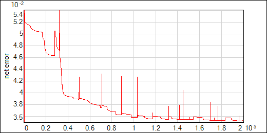
Push Go button on the network_start block to start the training process. Dynamic changes of the network structure are turned on, so expect that training will take more iterations. Network error plot may contain spikes and jups that occur when new neurons are tried. If training is not stable (error increases after the structure modification) try lower values of the dynamic structure algorithm parameters twins, dead and const (too high Step0 value also may cause unstability). Usually error function should look like on the following image. Network initial structure in this example contained 3 hidden neurons; 10 new neurons were added and 3 removed.
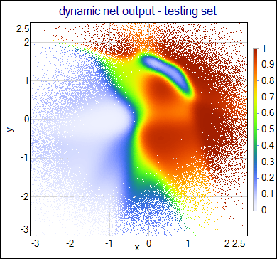
Next images present the network output for the testing set (coded as the color of the events shown on the scatter plot) and purity-efficiency curves obtained for the trained networks with dynamic and static structure. Results obtained for both types of the network are not very different in this case; significant benefit of the dynamic structure is automatic optimization of the hidden neurons number - static network structure requires multiple training of the networks with different sizes. Another advantage is possibility of escaping from local minima of the error function - this makes the training easier in more demanding tasks (see two-spiral separation example).
Note, the network from Very Simple example has fixed size. In this case overtraining can be controled with regularization. NetMaker allows to apply weight decay regularization by setting the training parameters WeightDecay and EnableBiasDecay. These parameters are tuned in Very Simple example to obtain smooth network output.
In case of dynamic network structure regularization factor has been tuned (decreased) to work well with the pruning procedures.